Landing pages for events are crucial to increasing the number of people that sign up for your event. But creating the right landing page can be difficult, especially if you don’t know where to look.
The kind of landing page you adopt can make or mar your purpose. A landing page can contain lots of content or be simplistic. This article will show you practical ways to create an ideal landing page for an event.

What Is an Event Landing Page?
An event landing has the sole aim of converting visitors into leads. It’s used to collect email addresses to promote concerts, conferences, and trade shows.
Simply put, it’s a webpage designed to give potential attendees all the information they need to register for an event.
Users click on contextual, banner, or targeted ads on Facebook, a Google search ad, or another digital venue to reach the event landing page.
In addition, an event landing is a page created to register site visitors in exchange for an incentive. Both multi-page sites and single-page landing pages can serve as landing pages in this case.
Reasons for Creating Landing Pages for Events
When organizing an event that will take place at a venue, there is always a specific goal in mind. It could be for a fundraising event, educational/personal development/social events.
Another benefit of having a landing page for an event is the increased potential for “word of mouth” promotion. Attendees are likelier to tell their friends about your event and spread the word online.
It is not sufficient to have landing pages for events alone. The goal of your event landing page should be to get people excited about attending your event and signing up.
Keep these guidelines in mind when creating your own landing page for an event.
1. Focus on a Single Conversion Metric
Like any good landing page, your event registration site should focus solely on attracting people to sign up for your event. The event’s title, design, and description should all work together to achieve this.
2. Attempt to Attract a Specific Subset of People
One of the best features of event landing pages is creating various versions to appeal to a wide variety of potential visitors. For instance, if you are trying to get startup owners interested in a marketing conference, you could make them a custom landing page.
3. Give People a Slice of the Action
To get people excited about attending your event, your landing page should include some elements of “fear of missing out” and “can’t-miss” fun. Consider providing an exclusive preview of the roster of presenters or a humorous look back at the previous year’s gathering. You might also use images and videos of memorable events from recent shows, as well as quotations from previous guests.
4. Precise Information
Before registering, guests should have a thorough understanding of the event. The most remarkable event landing pages provide all the essential information to encourage attendance. Your landing page’s content should suit the type of event you’re doing. It may contain information like the schedule, featured speakers, venue, and admission fees.
5. Clear CTA
Imagine giving out unclear directions to your venue. You wouldn’t want your landing page or RSVP form to be confusing. In its place, you should make the registration process as easy as possible. You’ll find that many of the most outstanding designs for event landing pages have intuitive sign-up processes.
Best Event Landing Page Examples You Should Try
There are several best practices and fantastic event landing page examples you can follow. Here are some of the best landing pages for your inspiration.
1. Collision Conference Ticket Landing Page
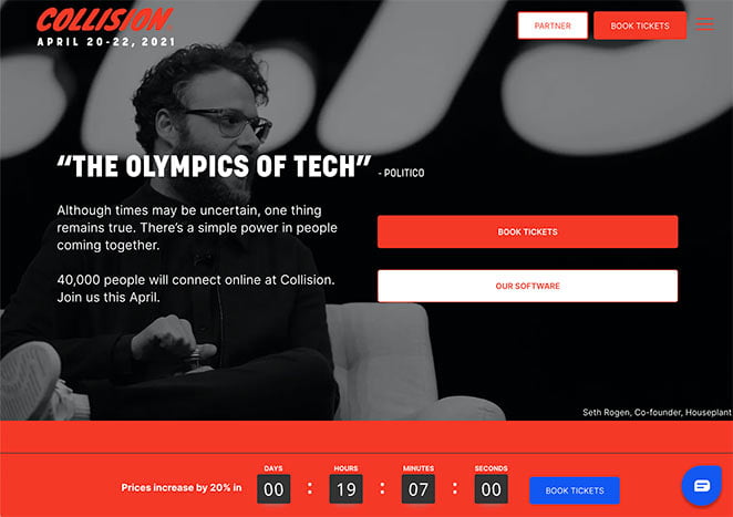
The Collision Conference’s purpose is to discuss technology’s impact on society today. It is one of the fastest-growing technology conferences in the United States and attracts A-list speakers from the corporate, academic, and entertainment sectors.
The homepage for the conference is engaging, simple to use, and consistent with the rest of the site’s design. This means it can be a solid foundation for your event page design.
Highlights from this ticketing page:
- The page layout is consistent with the brand, making it instantly recognizable to site visitors.
- This website features several statements, testimonials, and other forms of social proof that lend legitimacy to the event.
- You can view photos of each presenter by hovering over their names, and access other additional information by clicking on their portraits.
- Incorporating video onto the page increases its persuasiveness and ability to draw in visitors.
- Instilling a sense of impending doom through the prospect of a price hike prompts individuals to purchase tickets immediately (FOMO).
- Having several CTAs available makes it simple for users to sign up for the event.
2. Marketing Exchange B2B Event Landing Page
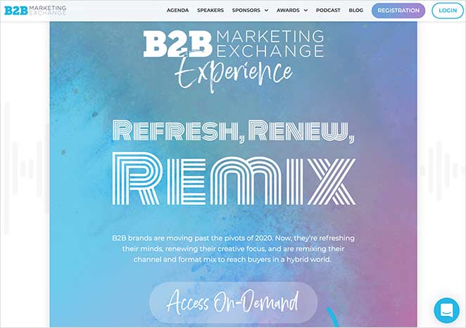
What follows is a sample from the B2B Marketing Exchange Experience. Guests visiting their event website are expertly guided from one section to the next.
The layout is uncomplicated, and visitors will have no trouble finding their way around.
Lessons learned from this event’s page layout:
- Animations can be used to better direct the reader’s attention to the various subsections of a web page.
- Each page is divided into subsections that detail specific aspects of the event.
- Reviews and testimonies from previous attendees add credibility and value to the event.
- Detailed biographies and links to each presenter’s work are provided.
- Including a Twitter feed with tweets from previous events demonstrates the event’s popularity.
- Credibility can also be boosted by displaying logos of the event’s sponsors.
- Several CTAs spread out around the page, making signing up a breeze.
3. Email Marketing Virtual Event Landing Page Example
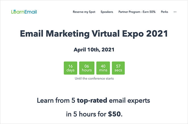
Learn Email’s page for their email marketing virtual exhibition is clean, concise, and functional. It’s a great illustration of how effective a basic event landing page design can be.
Lessons learned from this event’s page layout:
- The minimalist design allows the page content to stand out.
- Simple Sign-up Form One form field makes it simple for anyone to sign up.
- Speakers The compact and aesthetically pleasing design is aided by the speaker carousel’s small page footprint.
- The timer that counts down to an event’s start date encourages attendees to sign up quickly.
- Sponsors Having logos from major sponsors shown helps establish the event’s legitimacy.
- The title and section headings are benefit-driven, increasing the likelihood that you’ll continue reading.
- Users can register in several different ways.
4. Superweek Digital Marketing Conference Landing Page
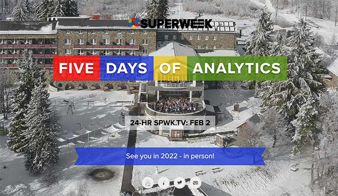
Superweek is an annual gathering for the industry’s top analysts, thought leaders, and digital marketers. You can tell right once that this website is focused on the analytics sector.
This event page is beautifully designed. It is attention-grabbing, comprehensive, and simple to navigate.
Lessons learned from this event’s page layout:
- The extensive use of images on this site is a massive part of what makes it so exciting and enjoyable to visitors.
- The use of video on the page gives viewers a preview of the material to come.
- Including a social network feed on the homepage creates the impression of an active community, which can increase visitors’ perception of the site’s reliability.
- Plan with the help of a complete agenda that includes travel and flight information.
5. WPEngine Decode Event Landing Page Design
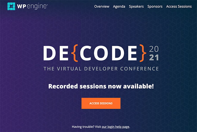
You can tell from the page’s headline alone that this is a developer-centric event.
As you explore the page, you’ll learn more about the conference and its speakers and even see photos from previous Decode events. It also has multiple call-to-action (CTA) buttons that visitors can use to register for the event and gain entry to the sessions.
Lessons learned from this event’s page layout:
- The headline is catchy and written with the intended audience in mind.
- Site visitors can immediately glean the event’s purpose and schedule.
- Headshots, titles, and areas of expertise are included for the featured speakers.
- Including logos of those who have financially supported the event helps to establish its legitimacy.
- If there is more than one call to action (CTA), attendees can quickly sign up and register.
To Wrap Up
An event landing page is the initial point of interaction for the visitor. Everything you put on this page will impact your conversion rate.
Explore All Squeeze Landing Page Hero Text Articles
Key Writing Tips for Better Landing Page Copy
If you want to boost your page conversions, then you need to make sure your landing page writing is effective.…
Free Thank You Landing Page Examples and Ideas
In online marketing, it is quite challenging to drive a significant amount of traffic into your site. It takes a…
Static Landing Page: Benefits and Drawbacks
A landing page is a webpage designed for an advertising or marketing campaign. It is where an individual “lands” on…
Tips to Boost Social Media Landing Pages
When you’re running a business online, you need to have systems in place to create an effective social media management…
Sales Funnel Landing Page Marketing Solution and Strategy
Engaging into online marketing is no easy task. You need to understand the various strategies you can use to drive…
Steps to Create Better Landing Page on Shopify
When thinking of the best way to launch your business and acquire quality traffic, a landing page is an excellent…
