The best lead gen landing pages have great design, captivating brief messages, and enticing CTAs.
Successful lead generation campaigns rely heavily on landing pages with a high conversion rate. This is especially true for those in the marketing industry who deal with expensive goods and services.
If you’re having trouble bringing in new business through digital marketing, you should read this piece on lead generation.
We’ll talk how to create a landing page that works using examples of great landing pages. Let’s start with a proper definition of a lead generation landing page.
What is a Lead Generation Landing Page?
A landing page for lead generation lets potential customers fill out contact info in exchange for a call or email.
Once customers provide contact information, they receive a call/email alert that a salesperson is on their way with more details. The goal of a lead generation page is to complete the information-gathering process.
You may ask, what is the purpose of a lead generation page? In almost all cases, the purpose of a lead generation page is to build leads. Starting from pre-qualified prospects to those that have expressed interest in becoming a customer.
Sometimes, lead generation landing pages are for prospective clients or clients too busy to visit your company website. In situations like this, a lead generation page is a great solution.
10 Best Lead Gen Landing Pages Worth Exploring
Landing pages should give potential customers what they need. The first impression should be compelling and the content fast-paced and relevant. Here are our top ten lead generation landing pages worth exploring.
1. Tidio
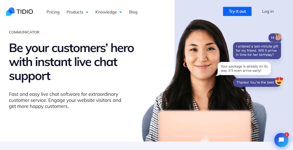
Live Chat landing pages on Tidio alleviate client frustrations and detail the system’s simplicity. This landing page style for lead generation is effective since it focuses initially on results and possible solutions. The page explains in detail how they handle the most frequent issues that arise in customer care.
2. Premium Content Shop
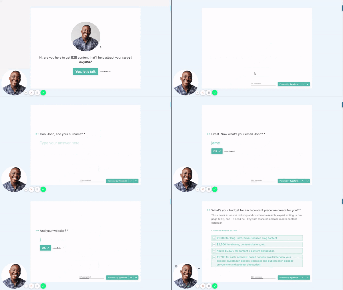
Landing pages that generate quality leads don’t necessarily need to stick to the tried-and-true format, especially regarding B2B content marketing. Premium Content Shop blog entries can also serve an instructional purpose.
The page seeks to direct readers interested in the subject and found the site organically to the contact form on Work with Us.
Additionally, that shape deviates from the norm. Learn how the form works by watching the accompanying GIF. With its simple design and clear instructions, the form is more like conversing with the creator.
3. Salesforce.
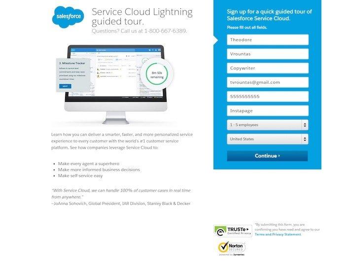
Unsurprisingly, a sales powerhouse like Salesforce would have a great homepage. The page succeeds because the language is brief and to the point. The security badges inspire confidence, and the form and CTA buttons jump out from the page’s design.
However, the pages themselves might use some tweaking. The most significant enhancement to this page would be to make the headline more interesting and distinctive.
4. Tableau.
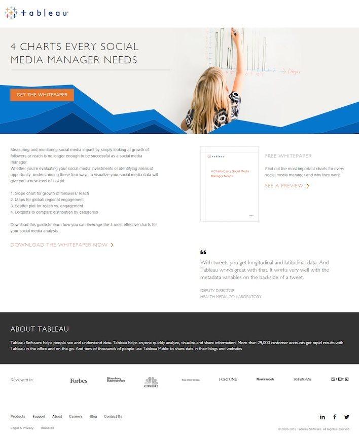
The Tableau homepage’s minimalism is its strength. It’s effective because it includes calls to action, badges from well-known periodicals, customer testimonials, and a free white paper sample.
However, two enhancements are needed to optimize this page significantly.
- Users can click on a logo on the white paper, which may divert attention from downloading the white paper.
- Second, several links in the footer divert attention away from the landing page and the white paper download process.
5. Microsoft Small Business Academy.
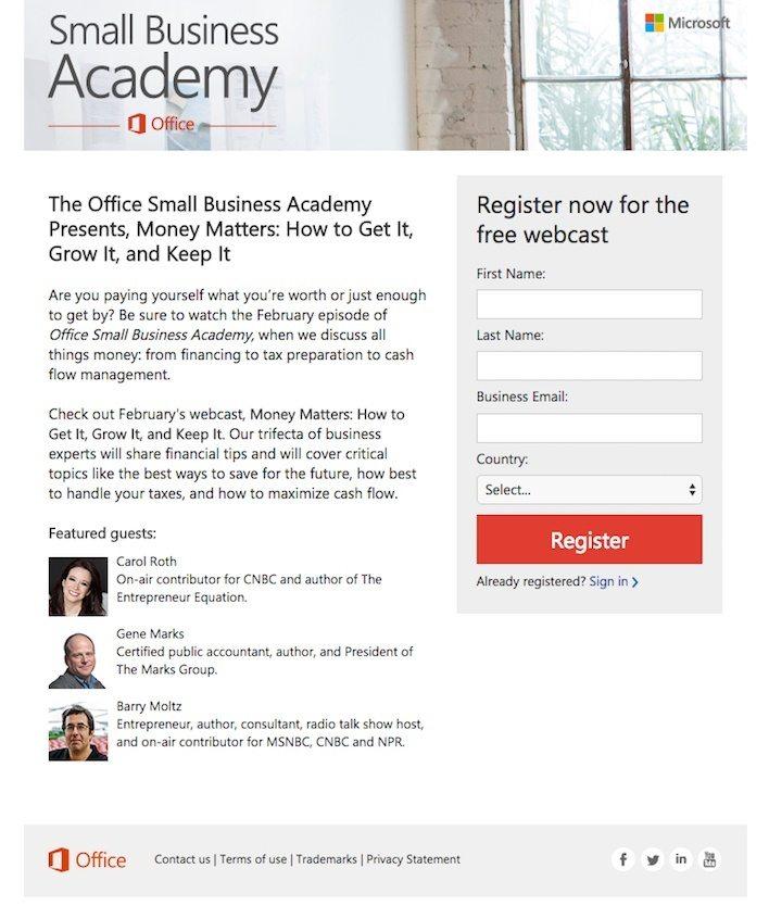
Microsoft Small Business Academy created this landing page to encourage people to sign up for a free webcast.
The page does its job rather well, although there are some prominent places where it can be enhanced.
The text of the call-to-action buttons might use some work. Even though the CTA button color is eye-catching when it comes to encouraging readers to interact with the page. The form is short, and the guest images are engaging.
The social media sharing icons on the homepage divert attention away from the webcast registration form.
Bounce rate would go down if there were people or other exciting things to see instead just a window and a tree.
6. Traffic & Funnels.
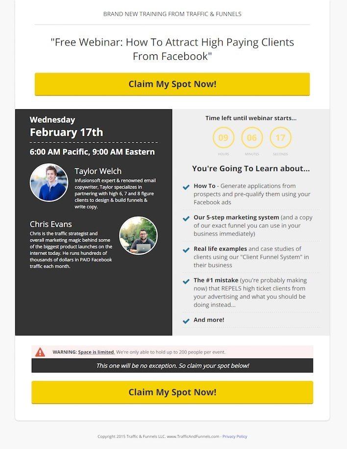
A company that aids in directing web traffic to specific destinations must have an effective landing page. Naturally, Traffic & Funnels would have a good web presence.
You can’t miss the two substantial call-to-action buttons on this page. Click-through rates are higher thanks to the urgency shown by the page’s warning message.
Since it stresses “free,” the page’s headline does a fine job of communicating value. Finally, the brief presenter biographies are helpful since they lend the page credibility.
However, the copyright date on this page is for the wrong year. If consumers read this, they can get the impression that the deal has already expired, which is a bad idea.
In addition, the typeface used for the countdown timer is terrible; it can be much brighter.
Lastly, though this page uses several good best design practices, it could be better. This page gives off an air of dubiousness. The site’s layout might use some work to make it look more professional.
7. ReachLocal
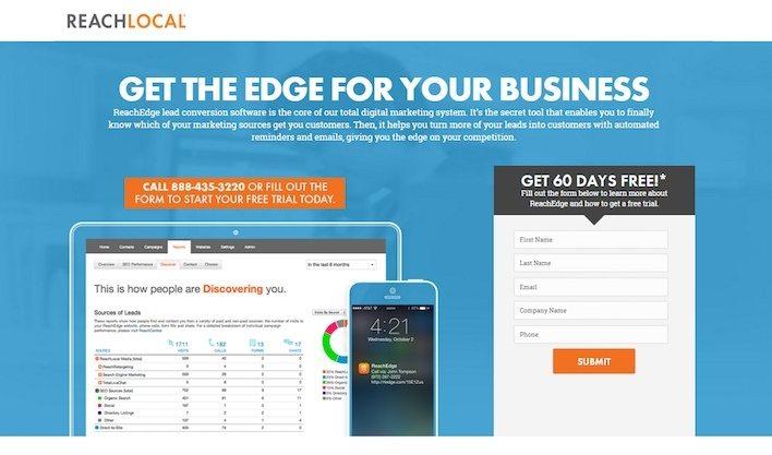
The ReachLocal homepage features eye-catching visuals that give you a sneak peek into the service. All the valuable information is laid out in bullet points for easy reading. The image does a great job of explaining things to potential buyers.
Yet, some kinks in this page’s current design need ironing out. For example, there are two different calls to action, which can be perplexing.
The visitor is given two options: download an informational sheet or begin a free trial. That’s somewhat confusion. What exactly is the page’s purpose?
Furthermore, “Submit” shouldn’t appear on the button that initiates submission. The word “submit” has a bad reputation for some reason.
The word “submit” is viewed as a friction word. In lay terms, “submit” contradicts people’s natural inclination to want to belong and participate in a group.
8. WordStream.
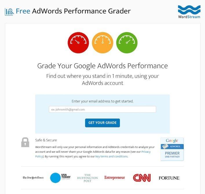
There is nothing else quite like WordStream out there. There’s a lot of value in assessing the efficacy of your AdWords advertisements, and they facilitate that.
There is only one form field and a clear call to action on this page. As the “1 minute” headline suggests, this service doesn’t require much of your time (so you have no reason not to do it).
Also, the page does a fantastic job of making the reader feel safe. Major media outlets have covered WordStream. There are also testimonials and a “Google AdWords Premier SMB Partner” logo on the page.
Because this page has so much material, the only significant alteration that could be made would be to remove some of the text.
Furthermore, there are far too many connections between ideas. A visitor’s attention can easily be diverted from an email collection form.
9. The Hoth.
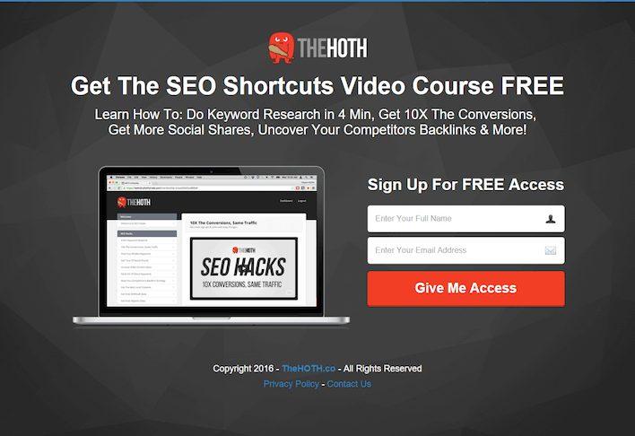
The Hoth website is uncluttered and easy to navigate, with a visible contact form and button. Furthermore, the page emphasizes no cost to use their goods and has blank spaces to make it soothing.
However, we see two issues that would indicate that this would be a low-scoring page.
- The footer links divert attention away from the landing page itself.
- Secondly, they did not need to prominently display links to the homepage, privacy statement, and contact information.
10. Airbnb
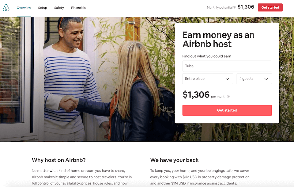
The Airbnb “Overview” page is concise and to the point. Despite the limited amount of words, Airbnb conveys potential earnings with its straightforward interface. They then build trust with their readers by writing persuasive landing page copy.
The designers made good use of white space, so the user doesn’t feel overwhelmed. The most important results are presented in visually appealing feature boxes, while the form remains the page’s primary focus.
Benefits to the user are obvious, and the page’s sparse usage of orange helps the CTA stand out.
Conclusion
Whether you’re looking for leads for your website, blog, or campaign, these are the best lead gen landing pages worth your time. Use them to fine tune your landing page and have the edge over lead capture in your industry.
Explore All Squeeze Landing Page Hero Text Articles
Key Writing Tips for Better Landing Page Copy
If you want to boost your page conversions, then you need to make sure your landing page writing is effective.…
Free Thank You Landing Page Examples and Ideas
In online marketing, it is quite challenging to drive a significant amount of traffic into your site. It takes a…
Static Landing Page: Benefits and Drawbacks
A landing page is a webpage designed for an advertising or marketing campaign. It is where an individual “lands” on…
Tips to Boost Social Media Landing Pages
When you’re running a business online, you need to have systems in place to create an effective social media management…
Sales Funnel Landing Page Marketing Solution and Strategy
Engaging into online marketing is no easy task. You need to understand the various strategies you can use to drive…
Steps to Create Better Landing Page on Shopify
When thinking of the best way to launch your business and acquire quality traffic, a landing page is an excellent…
