Are you looking for some great squeeze page examples? You have landed on the right page! With a squeeze page, it’s considerably simpler to persuade visitors to take the course of action you want.
The most effective squeeze pages combine a variety of conversion-focused techniques, such as enticing CTA buttons, immediate contact options, and persuasive messaging.
This article covers everything you need to know about a squeeze page, along with some great examples.
What Is a Squeeze Page?
Suppose you’re reading through an article, and halfway through the content you’re interrupted by a pop-up page that asks for your email.
That’s a squeeze page!
A squeeze page is similar to a landing page which is created to collect the email addresses of your website visitors. The name “squeeze” comes from the idea of squeezing information from users or visitors. These squeeze pages typically provide something valuable in exchange for users’ contact information.
Although squeeze pages are short, they always contain the following components:
- Headlines highlighting the benefits of your offer
- Supporting content to help users make a choice
- A contact form for users to take action without leaving your page.
Why Is a Squeeze Page Important?
In times of uncertainty or disappointment, people will often make impulsive decisions. You make it easy for people to embrace your goods by showing the value you offer and ensuring they don’t feel left out.
In other words, a squeeze page is an extension of your CTA. It should also signify the value your product or service will offer someone who takes action to take advantage of it.
The conversion rates are incredibly high when the squeeze page is pitched well and advertises the right product.
Squeeze Page Vs. Landing Page: Know the Difference
Often, squeeze pages are confused with landing pages. And while they share the same objective, they’re two distinct types of pages.
A landing page can be used for a lot of objectives, including obtaining a free trial, signing up for a webinar, or downloading something. In addition to generating leads, they can also be used to promote items or events, do surveys or quizzes, or drive sales.
A squeeze page can also be used for all these purposes, but the primary objective is to collect email addresses from users. Success would be determined by how many email addresses were obtained through a squeeze page.
Some of the Great Squeeze Page Examples
The purpose of a squeeze page is to get visitors to take immediate action, to become a customer. Squeeze pages allow you to build a list of people interested in your product or service, who can eventually convert into paying customers. The following are some of the best examples of squeeze pages to collect email addresses.
Example 1: Free Guide Squeeze Page

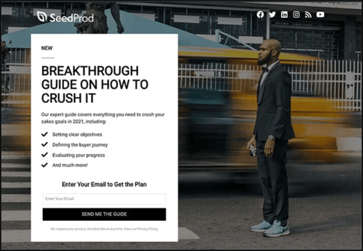
This simple squeeze page offers the visitor to sign up for a free guide to meet their sales objectives in the coming years.
Offering a free guide is an excellent approach to attracting potential customers. For this squeeze page to be effective, your free guide must be in line with your audience’s interests.
This Free Guide Squeeze Page works because of the following:
- The bold and attention-grabbing headline highlights the benefits of opting in.
- You get a solid understanding of the contents of the guide from the description.
- The simple opt-in form only requires an email address, reducing visitors’ friction from signing up.
- The eye-catching CTA button stands out on the page, encouraging users to click and opt in for the offer.
Examples 2: Real Estate Squeeze Page

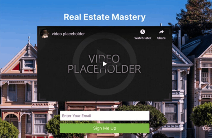
This real estate squeeze page engages the visitor and conveys their message through a video. It helps them convince visitors to take action because video messages are easier to recall than plain text.
This Real Estate Squeeze Page works because of the following:
- Removing the navigation bar from the top leaves users with no option to click away but to stay on the page. This allows users to stick around for a while and hear your message to act on it.
- As mentioned before, video content is more powerful than copy at making your point clear to the visitors. It makes complex information easier to understand and is more memorable.
- The short opt-in form only asks for the email address to sign up, making users follow the action quickly without driving them away.
- Rather than using generic button text like “join” or “subscribe,” it uses a CTA button that clearly states what you want people to accomplish.
Example 3: Urgency Squeeze Page

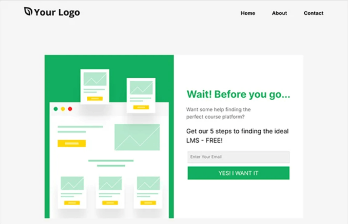
In this landing page design, users are urged to wait before departing the website. Users opt-in to get a free guide for finding the ideal platform for online courses. The prominent CTA button and messaging entice users to click and opt in.
This Urgency Squeeze Page works because of the following:
- The compelling headline uses the word “wait,” which gives readers a sense of urgency. This naturally prompts people to inquire as to why they should have to wait.
- The short and simple description makes it clear and gives readers an incentive for why they should wait and sign up.
- The opt-in form is simple and requires only the email address, which makes users sign up quickly for the offer in exchange.
- Rather than using generic wording, the CTA button connects with the reader and persuades them to take action.
Conclusion
Squeeze pages can help you convert email leads into real customers. It’s really a smart way to market so that your email subscribers are tempted to move on for their free product or service.
With this content, your email list builds up, and you generate leads that can help you increase revenue and sell more products and services.
This article provides some great squeeze page examples to help you craft the best one for your company website.
Explore All Squeeze Landing Page Hero Text Articles
Key Writing Tips for Better Landing Page Copy
If you want to boost your page conversions, then you need to make sure your landing page writing is effective.…
Free Thank You Landing Page Examples and Ideas
In online marketing, it is quite challenging to drive a significant amount of traffic into your site. It takes a…
Static Landing Page: Benefits and Drawbacks
A landing page is a webpage designed for an advertising or marketing campaign. It is where an individual “lands” on…
Tips to Boost Social Media Landing Pages
When you’re running a business online, you need to have systems in place to create an effective social media management…
Sales Funnel Landing Page Marketing Solution and Strategy
Engaging into online marketing is no easy task. You need to understand the various strategies you can use to drive…
Steps to Create Better Landing Page on Shopify
When thinking of the best way to launch your business and acquire quality traffic, a landing page is an excellent…
