

The best landing pages have a clear goal, a clear purpose, and an engaging message that is right for their market. Landing pages serve as the first point of contact with your market audience.
It’s a fundamental part of the marketing strategy, and if done correctly, a landing page leads to conversions. The goal of a landing page is to capture your audience’s contact information as a potential lead.
This article will analyze landing page examples with tips to increase conversions. Read on!
What is a Landing Page?
A landing page is a website’s homepage for a specific campaign. This homepage is similar to the main website but focuses more on the campaign. As a result, many call it a “front door” for their visitors who click on the lead capture form.
Landing pages are meant to be interacted with by the visitors to promote a greater interest in your brand. For example, they can showcase your product or promote a bonus.
They are also often promotional and oriented towards conversions. Thus, their primary role is to lead to sales or persuade visitors to visit other pages on the website.
12 Great Landing Page Examples Worth Exploring
These examples below will give you the key components you should look out for in a landing page for your online business marketing. Let’s get started.
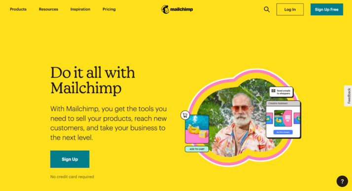
1. Mailchimp
First of all, take note of the backdrop hue, which is a bright and cheery yellow. It’s an eye-catching change from the more somber homepage while staying true to the company’s style.
This landing page stands out for its color and prominent call to action. The website has multiple calls to action (“Sign Up”). The same button appears regardless of how far down the page you go.
Since the call to action serves as a portal for converting customers, this is a great tactic. Users should be able to access it multiple times as they scroll the page, not only once at the top.
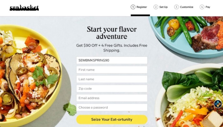
2. Sunbasket
On its landing page, Sunbasket compares itself head-to-head with Blue Apron, one of its biggest rivals in the meal delivery market. On this page, you’ll find a comparison table showing how Sunbasket outshines Blue Apron in various categories.
You can demonstrate your product’s superiority over the competition by drawing parallels to competing offerings. It’s a clever strategy for convincing prospective clients that you’re the best option.
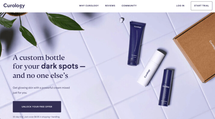
3. Curology
I think the top fold and the call to action are the most crucial parts of a landing page. The copy above the fold in Curology is brief (less than 50 characters) and visually appealing. The offer’s value and potential utility are readily apparent to users.
If you are unfamiliar with the brand, the message is clear: whatever your skin concerns, Curology has a bespoke treatment for you.
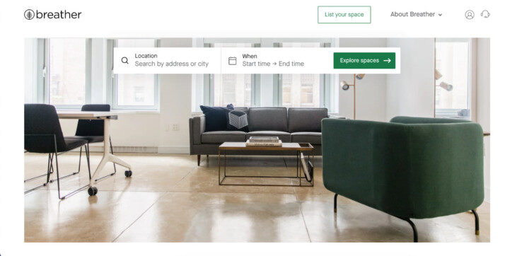
4. Breather
Here’s another landing page that uses innovative and enjoyable design. The first thing you’re prompted to do while visiting Breather.com is select the location(s) where you’re interested in finding a space.
In addition, it makes use of your current site to provide relevant results immediately.
We appreciate that Breather’s homepage only has a few lines of material explaining the company’s purpose before prompting the reader to choose a city.
Also, in keeping with the nature of the product is the use of white space and a calming color palette.
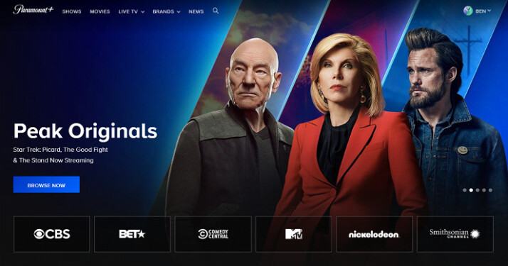
5. Paramount Plus
The design of this landing page contains everything you might want. It’s visually beautiful, interactive, and provides scannable yet meaningful headers like “Peak Streaming,” “Peak Originals,” and “Peak Family Team,” among others. In addition, the background makes each fold look somewhat different, making for a visually exciting and engaging scrolling experience.
It has multiple content offers, and a prominent call to action which increases the likelihood that site visitors will take the desired action.
6. Paramount Plus
The design of this landing page contains everything you might want. It’s visually beautiful, interactive, and provides scannable yet meaningful headers like “Peak Streaming,” “Peak Originals,” and “Peak Family Team,” among others. In addition, the background makes each fold look somewhat different, making for a visually exciting and engaging scrolling experience.
It has multiple content offers, and a prominent call to action which increases the likelihood that site visitors will take the desired action.
7. Paramount Plus
The design of this landing page contains everything you might want. It’s visually beautiful, interactive, and provides scannable yet meaningful headers like “Peak Streaming,” “Peak Originals,” and “Peak Family Team,” among others. In addition, the background makes each fold look somewhat different, making for a visually exciting and engaging scrolling experience.
It has multiple content offers, and a prominent call to action which increases the likelihood that site visitors will take the desired action.
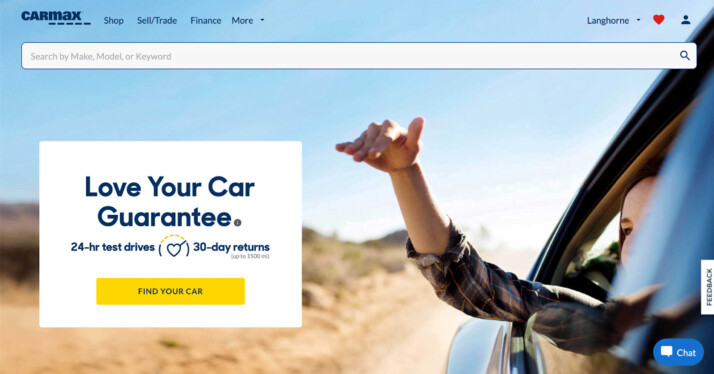
8. CarMax
CarMax is prepared to give its customers the means to undertake their investigation before ever leaving the homepage. It has a search bar connecting users to a car inventory database and a calculator that helps them determine their monthly payments.
Additionally, there are a form customers may fill out to get a quote on their vehicle sale.
CarMax’s goal is to make buying or selling a car as easy as possible for its customers. CarMax’s home page reflects the company’s customer-first philosophy by making buying a vehicle seem less daunting and more straightforward.
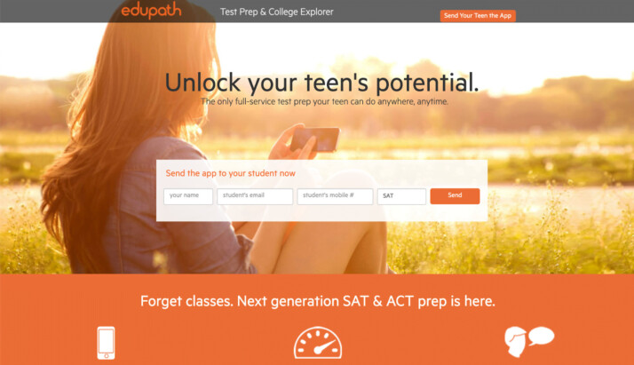
9. Edupath
Who are you hoping to attract with your landing page? Much of the content on Edupath is written with students in mind. However, parents may also find useful tips for guiding their children through the college application process and the SAT on the site.
One of these parts contains the landing page you see below.
Parents can have their teens receive a link to download the Edupath app by providing their names, email addresses, and mobile phone numbers. The people at Edupath are aware that pupils would comply with parental requests if it means they may keep using their phones.
Moreover, it only takes a single mouse click. The persuasion process through parents is a brilliant and valuable strategy for spreading the apps to more students’ mobile devices.
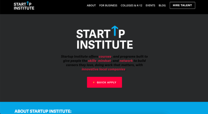
10. Startup Institute
Your website’s visitors will not voluntarily disclose sensitive information to you unless they perceive some benefit.
Startup Institute’s homepage features a FAQ section right next to the application form. It clarifies in no uncertain terms what will occur after the submission of an application. It could make some people like, “They read my mind!”
Chances that visitors will hesitate before giving their information by establishing their expectations on the landing page is reduced.
11. Calm
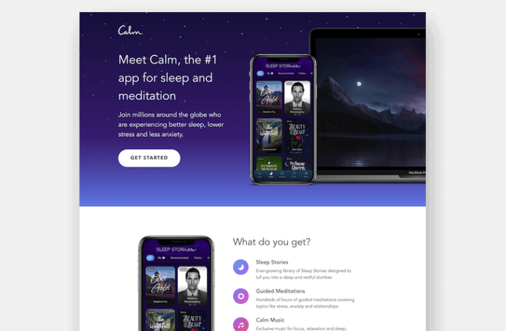
We could all use a little more peace and quiet in our lives, which Calm hopes to provide. It’s a sleep and meditation software with tools to help users unwind from their hectic days.
Visitors to the app’s website are greeted by this landing page, which prompts them to begin using Calm.
The design of the Calm homepage exemplifies the company’s ethos. The writing is simple and to the point to avoid confusing site visitors.
“Meet Calm” as a title sets the tone for the piece. The homepage gets to the point by encouraging visitors to join the millions of people already on the path to better health.
Calm’s homepage uses soothing blues and greens for its background which has a calming effect. The stars in the clear, dark sky illuminate the most calming hue in the cosmos (blue). In addition to being aesthetically pleasing, pastels and other muted tones can help bring about a state of Calm that we can all appreciate.
12. Zola
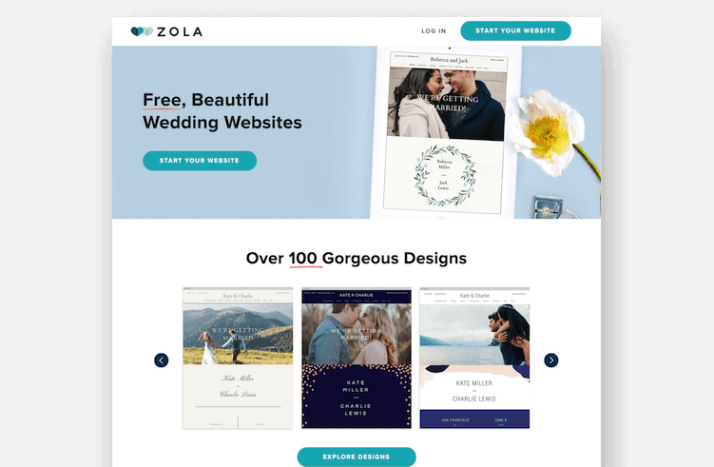
Regarding wedding preparations, Zola is the newest startup to do things differently. Zola is a comprehensive resource for engaged couples. It provides a wedding registry and a database of wedding locations and vendors.
Their guiding principle is to facilitate all aspects of a wedding, from the invites through the honeymoon.
The word “free” is prominent on the webpage, attracting would-be couples looking to save money without sacrificing quality.
On the webpage, real wedding images taken by pros show users how their engagement photos will look utilizing Zola’s designs.
Zola incentivizes users to combine their free website with their discounted save-the-date cards. As a result, it’s much simpler to bundle services, which is great for couples because it allows them to accomplish more with less effort.
Conclusion
There are many benefits to having a landing page. It’s a website that has no other purpose than to encourage people to take the next step.
Landing pages are also an excellent way to present an offer with a differentiator that stands out from the competition.

' fill='url(%23paint0_linear_305_19873)'/%3E%3Cpath d='M15.0923 27.8281H11.084V15.8031H15.0923V27.8281ZM13.089 14.1997C11.9802 14.1997 11.084 13.3011 11.084 12.1948C11.084 11.0885 11.9819 10.1914 13.089 10.1914C14.1936 10.1914 15.0923 11.0901 15.0923 12.1948C15.0923 13.3011 14.1936 14.1997 13.089 14.1997ZM29.5223 27.8281H25.6687V21.9759C25.6687 20.5802 25.6423 18.7853 23.6653 18.7853C21.6588 18.7853 21.3501 20.3052 21.3501 21.8749V27.8281H17.4973V15.7943H21.1962V17.4385H21.2483C21.763 16.4925 23.0208 15.4952 24.8967 15.4952C28.8008 15.4952 29.5223 17.9876 29.5223 21.228V27.8281Z' fill='white'/%3E%3Cdefs%3E%3ClinearGradient id='paint0_linear_305_19873' x1='20' y1='-1.90735e-06' x2='20' y2='40' gradientUnits='userSpaceOnUse'%3E%3Cstop stop-color='%23E45C96'/%3E%3Cstop offset='1' stop-color='%23FF85B9'/%3E%3C/linearGradient%3E%3C/defs%3E%3C/svg%3E%0A "Abir Ghenaiet LinkedIn")
'/%3E%3Cg clip-path='url(%23clip0_305_19877)'%3E%3Cpath d='M27.9057 12.4229H11.8723C10.77 12.4229 9.87818 13.3247 9.87818 14.427L9.86816 26.452C9.86816 27.5543 10.77 28.4562 11.8723 28.4562H27.9057C29.008 28.4562 29.9098 27.5543 29.9098 26.452V14.427C29.9098 13.3247 29.008 12.4229 27.9057 12.4229ZM27.9057 26.452H11.8723V16.4312L19.889 21.4416L27.9057 16.4312V26.452ZM19.889 19.4374L11.8723 14.427H27.9057L19.889 19.4374Z' fill='white'/%3E%3C/g%3E%3Cdefs%3E%3ClinearGradient id='paint0_linear_305_19877' x1='20' y1='0' x2='20' y2='40' gradientUnits='userSpaceOnUse'%3E%3Cstop stop-color='%23E45C96'/%3E%3Cstop offset='1' stop-color='%23FF85B9'/%3E%3C/linearGradient%3E%3CclipPath id='clip0_305_19877'%3E%3Crect width='24.05' height='24.05' fill='white' transform='translate(7.86621 8.41406)'/%3E%3C/clipPath%3E%3C/defs%3E%3C/svg%3E%0A "Email Abir Ghenaiet")
Explore All Squeeze Landing Page Hero Text Articles
Key Writing Tips for Better Landing Page Copy
If you want to boost your page conversions, then you need to make sure your landing page writing is effective.…
Free Thank You Landing Page Examples and Ideas
In online marketing, it is quite challenging to drive a significant amount of traffic into your site. It takes a…
Static Landing Page: Benefits and Drawbacks
A landing page is a webpage designed for an advertising or marketing campaign. It is where an individual “lands” on…
Tips to Boost Social Media Landing Pages
When you’re running a business online, you need to have systems in place to create an effective social media management…
Sales Funnel Landing Page Marketing Solution and Strategy
Engaging into online marketing is no easy task. You need to understand the various strategies you can use to drive…
Steps to Create Better Landing Page on Shopify
When thinking of the best way to launch your business and acquire quality traffic, a landing page is an excellent…